
EAKIN
BRIEF
Name and create an identity for a new ostomy bag range (poo bags to you and I) for Eakin, one of the world’s biggest medical suppliers.
RESULT
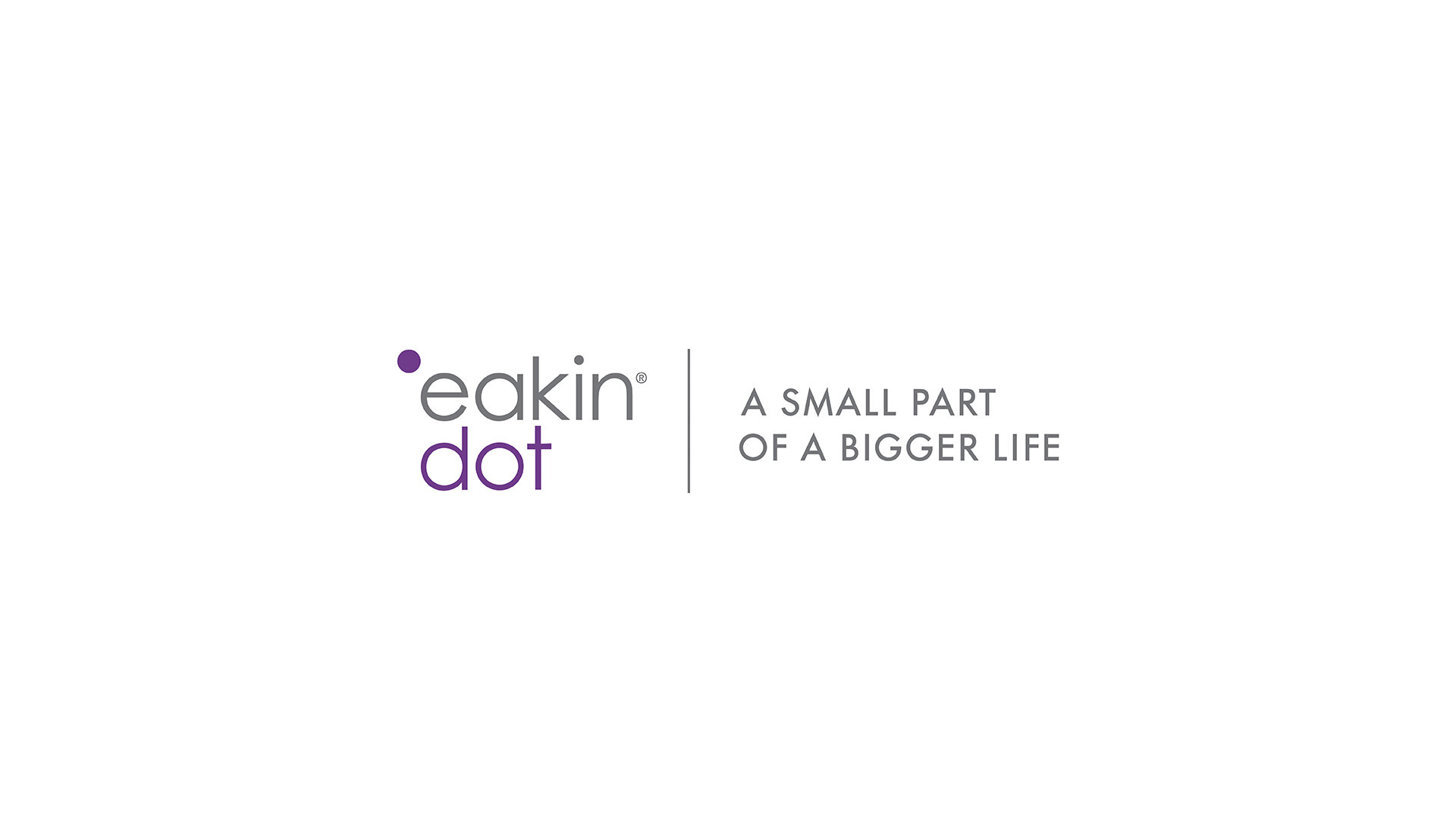
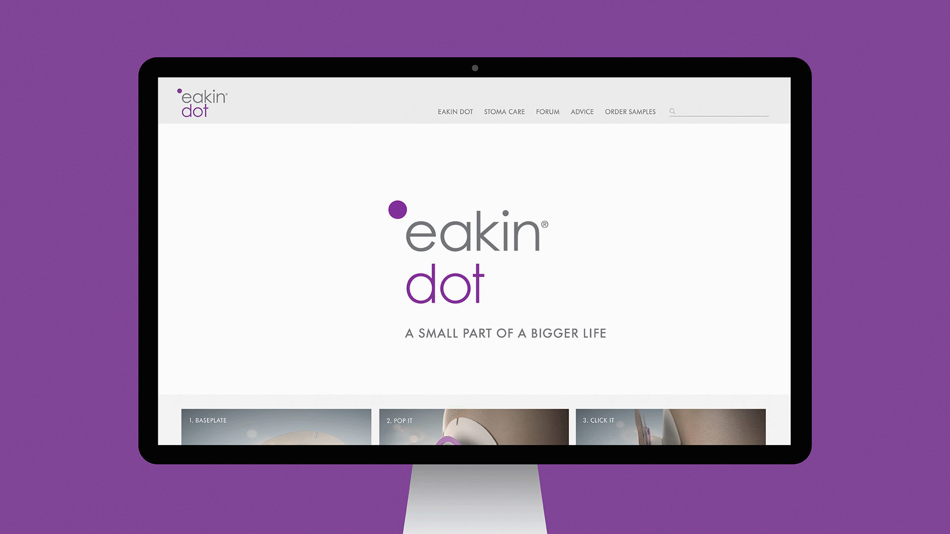
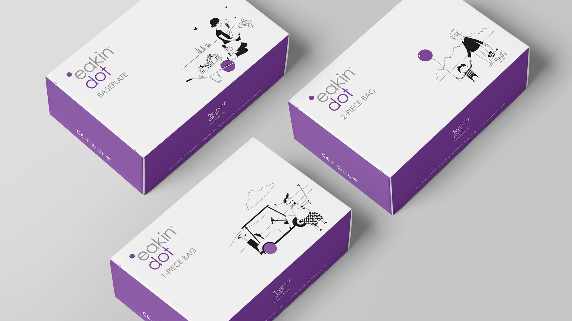
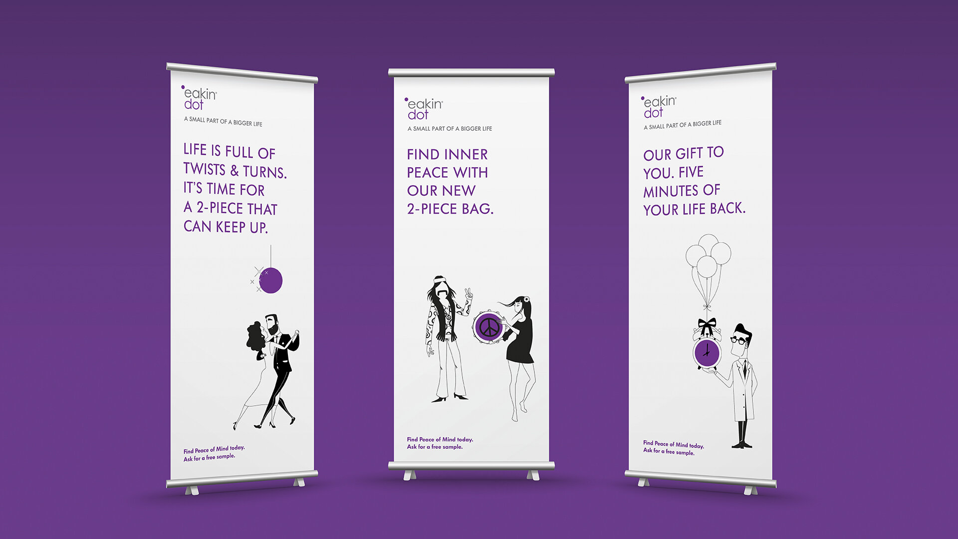
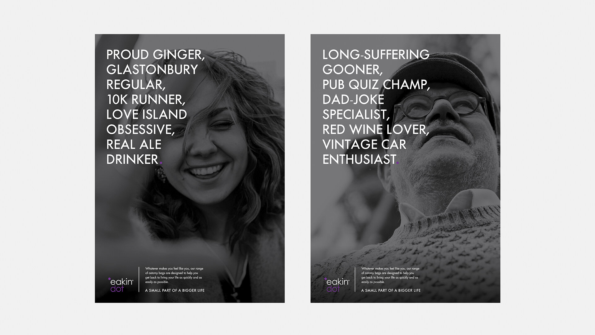
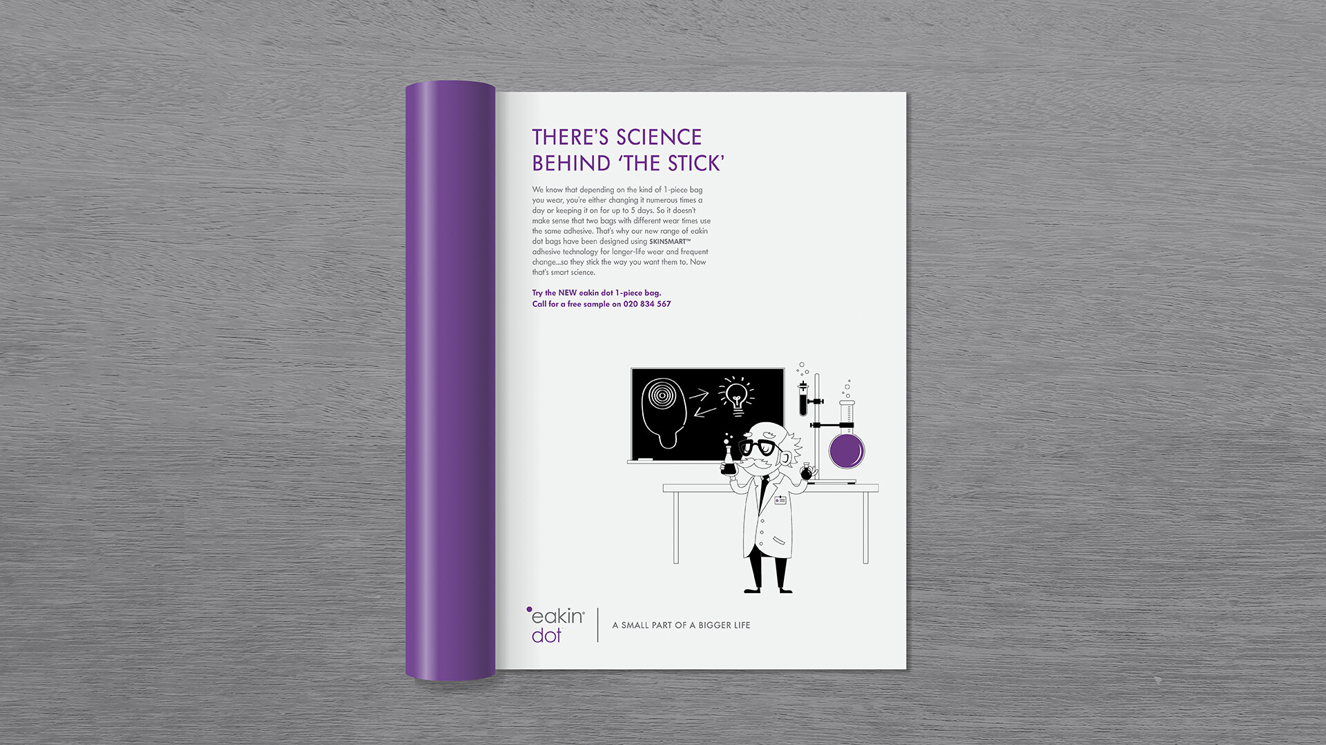
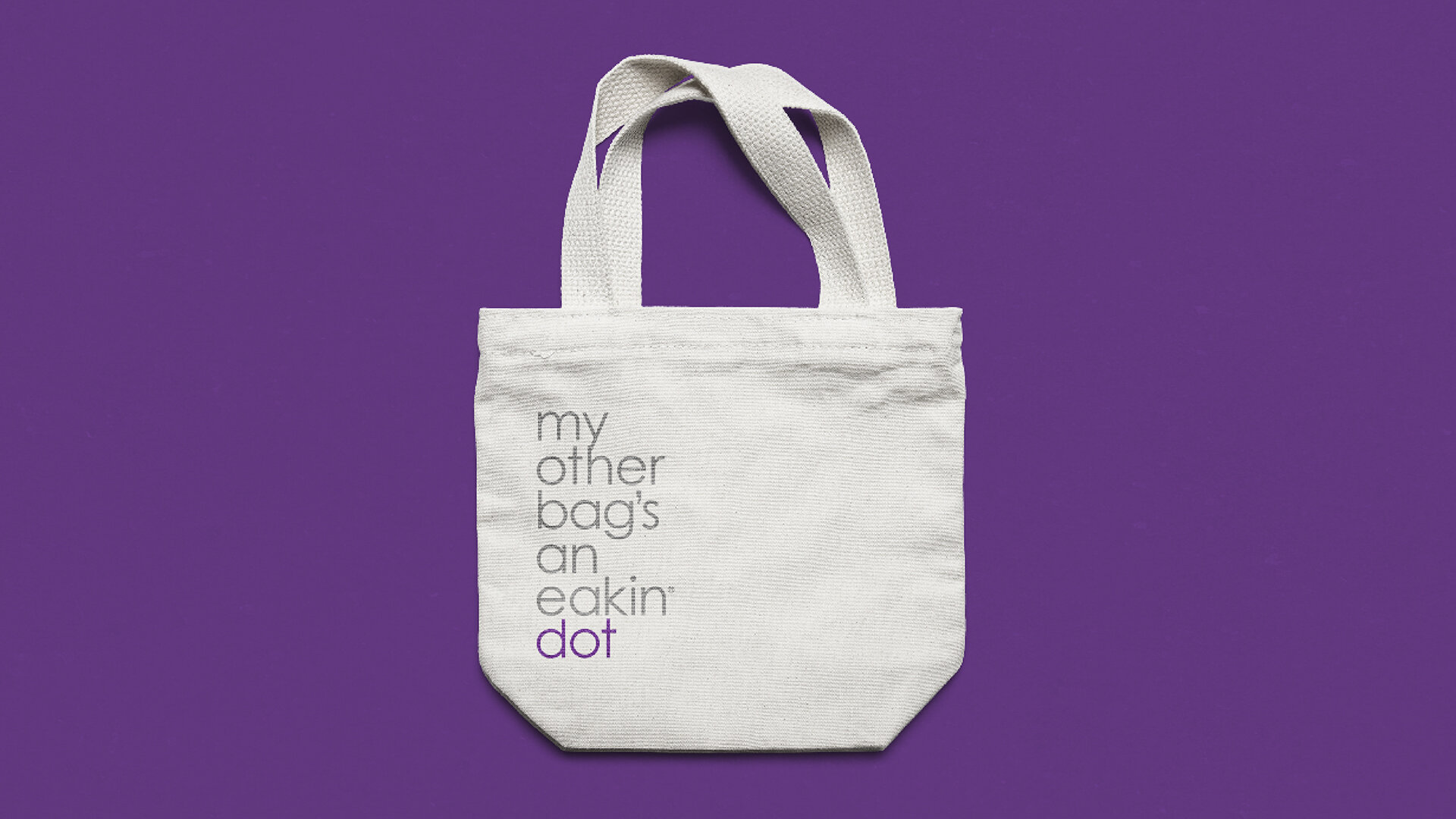
Eakin dot was our winning name, with the ‘dot’ signifying how minimally the new bags impact ones life because of its innovative features. The strategy which underpinned the identity was ‘a small part of a bigger life’. This was reflected in the visuals whether illustrative, typographic or photographic. We ditched the medical jargon and focused on eakin dot enabling people to live life to the full.