
SUPA NETWORK
BRIEF
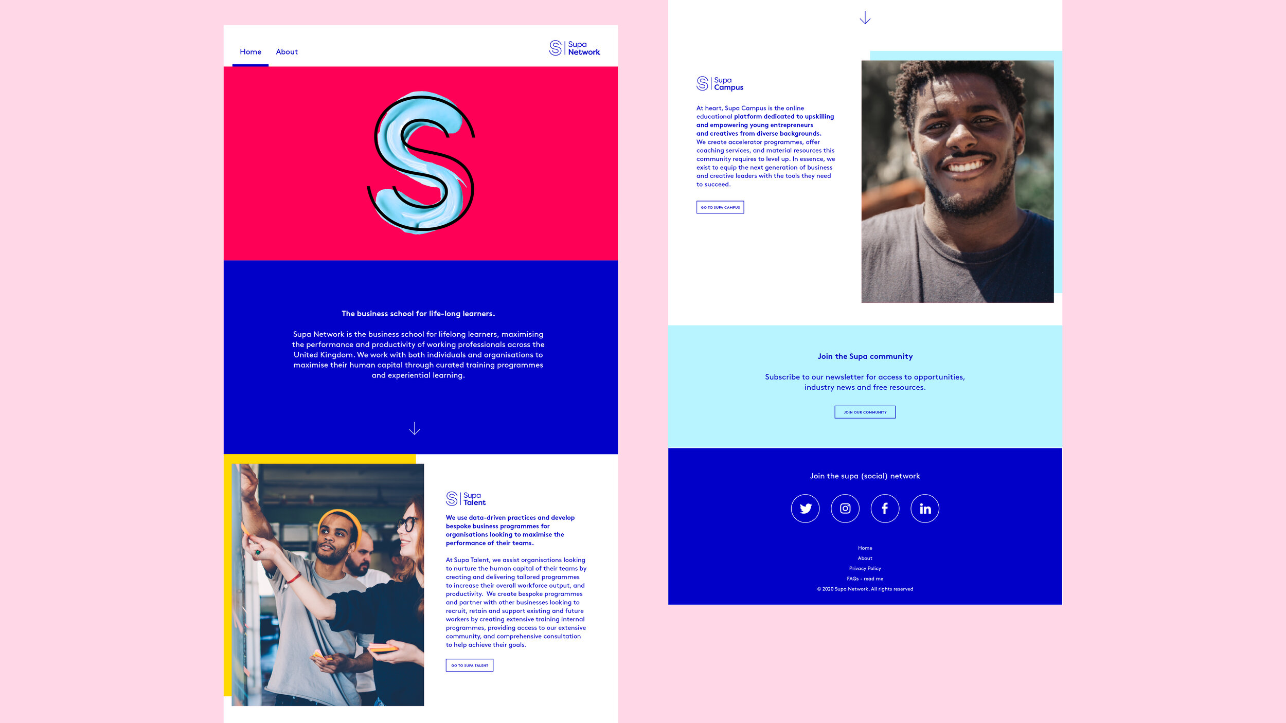
A rebrand to unify the multiple initiatives offered by Supa, a vibrant company which partners established businesses with young talent, particularly those from disadvantaged backgrounds.
RESULT
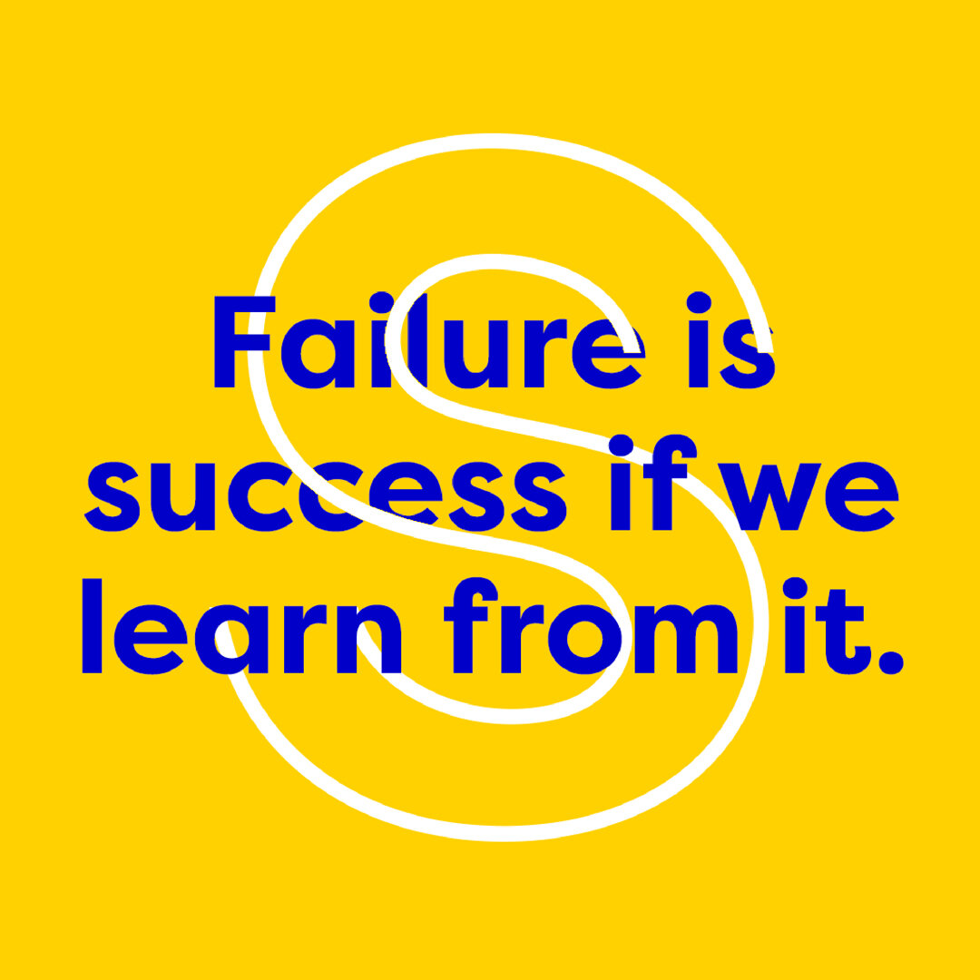
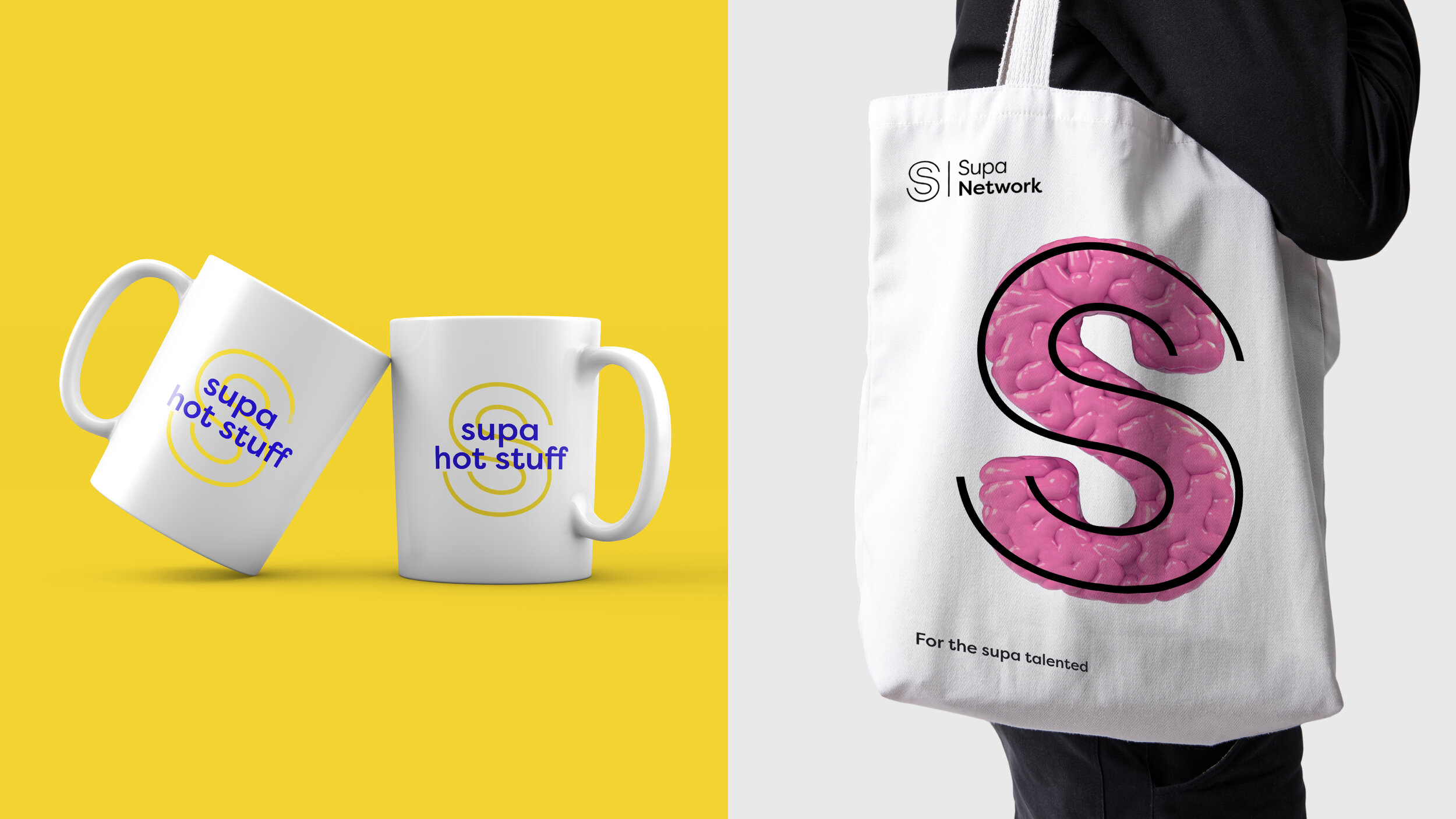
A dynamic logo for a dynamic brand. A simple lockup with a flexible ‘S’.