
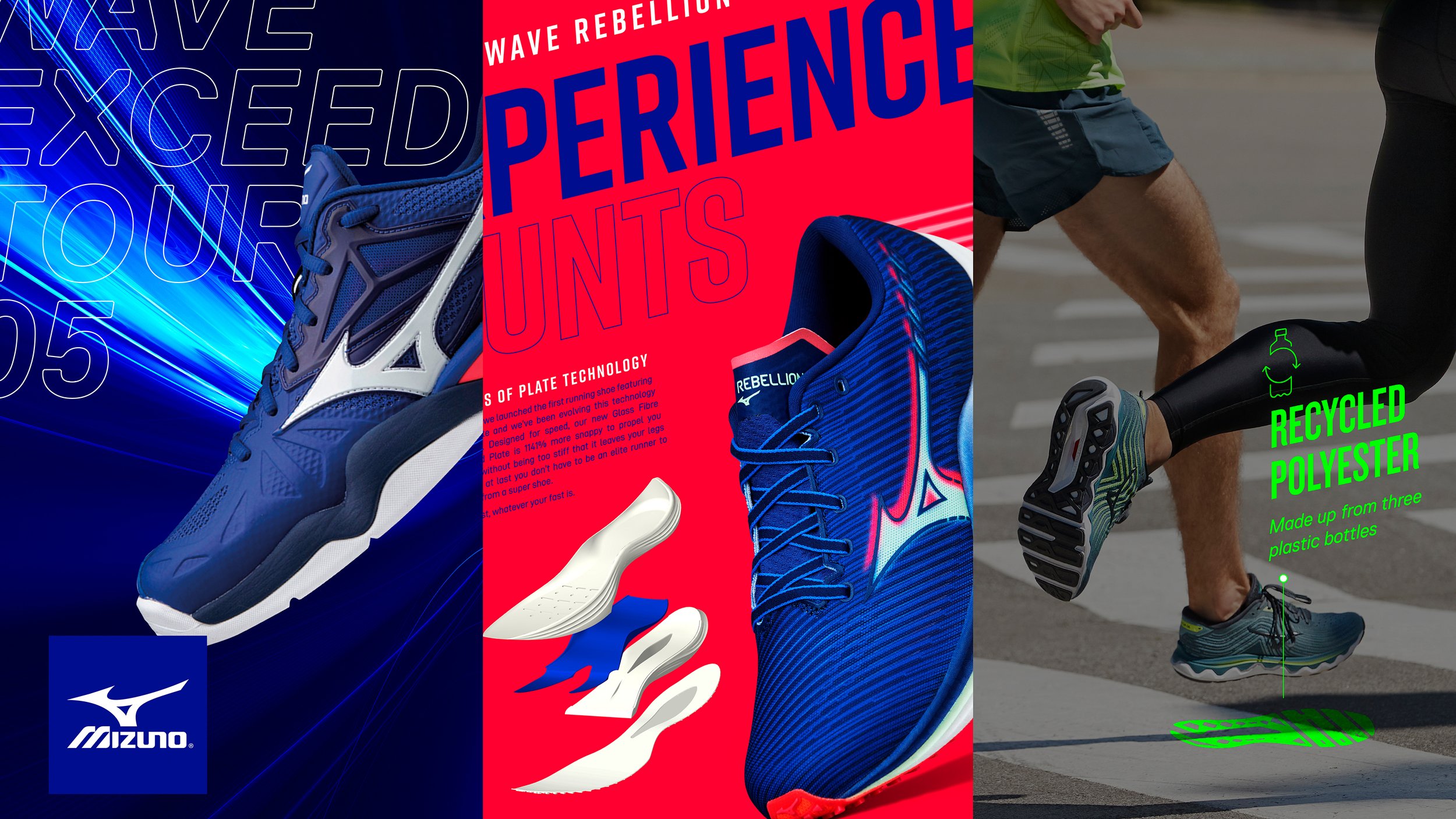
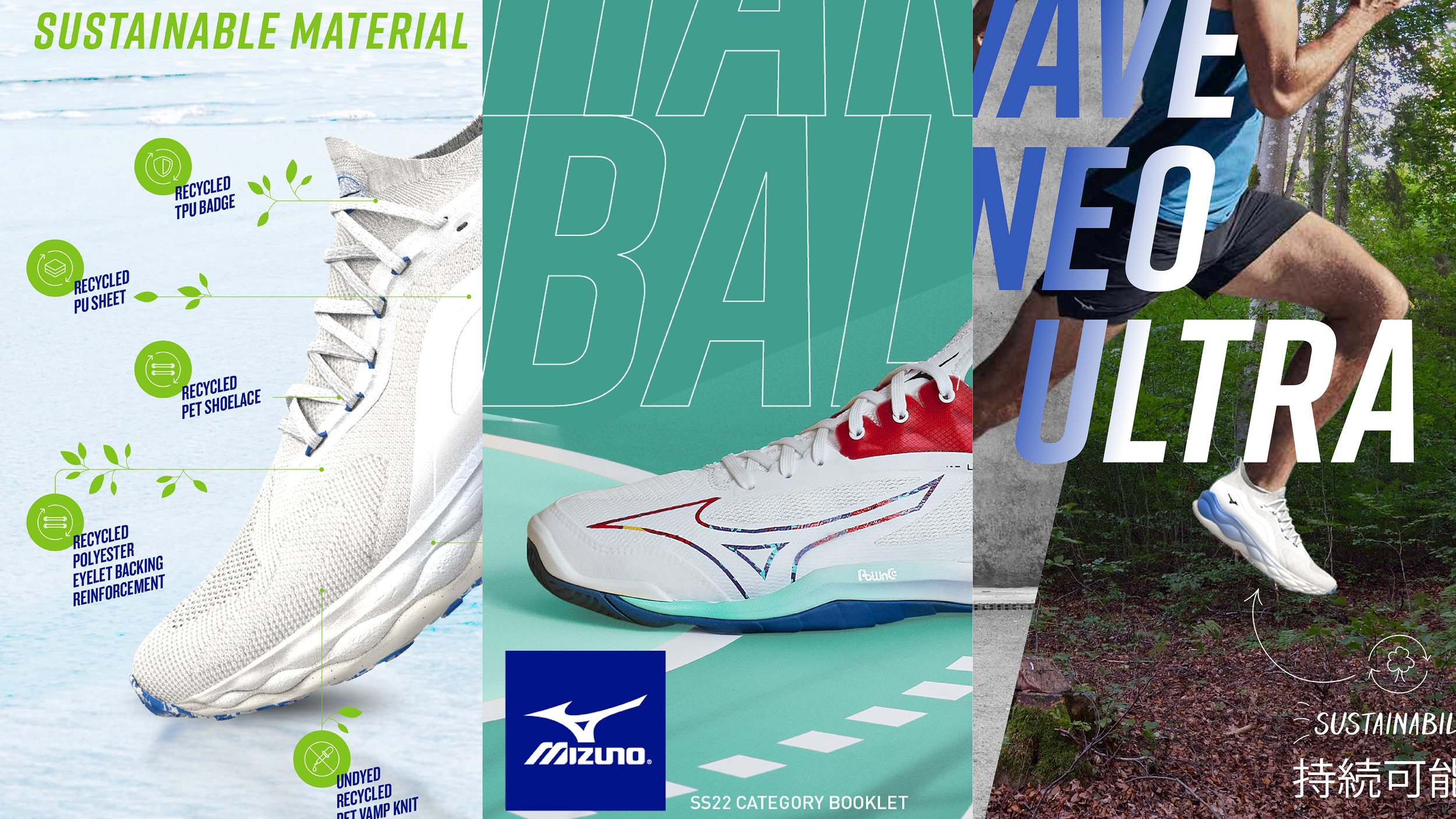
MIZUNO
BRIEF
Various design work for Mizuno’s broad spectrum of athletic footwear.
RESULT
As part of an ongoing relationship with Motus Creative, Unreal has been working on a host of projects for the Japanese sportswear giant. From look and feel concepts for sustainable shoes to interactive booklets categorised by sport, the work is diverse whilst in-keeping with the core brand identity.

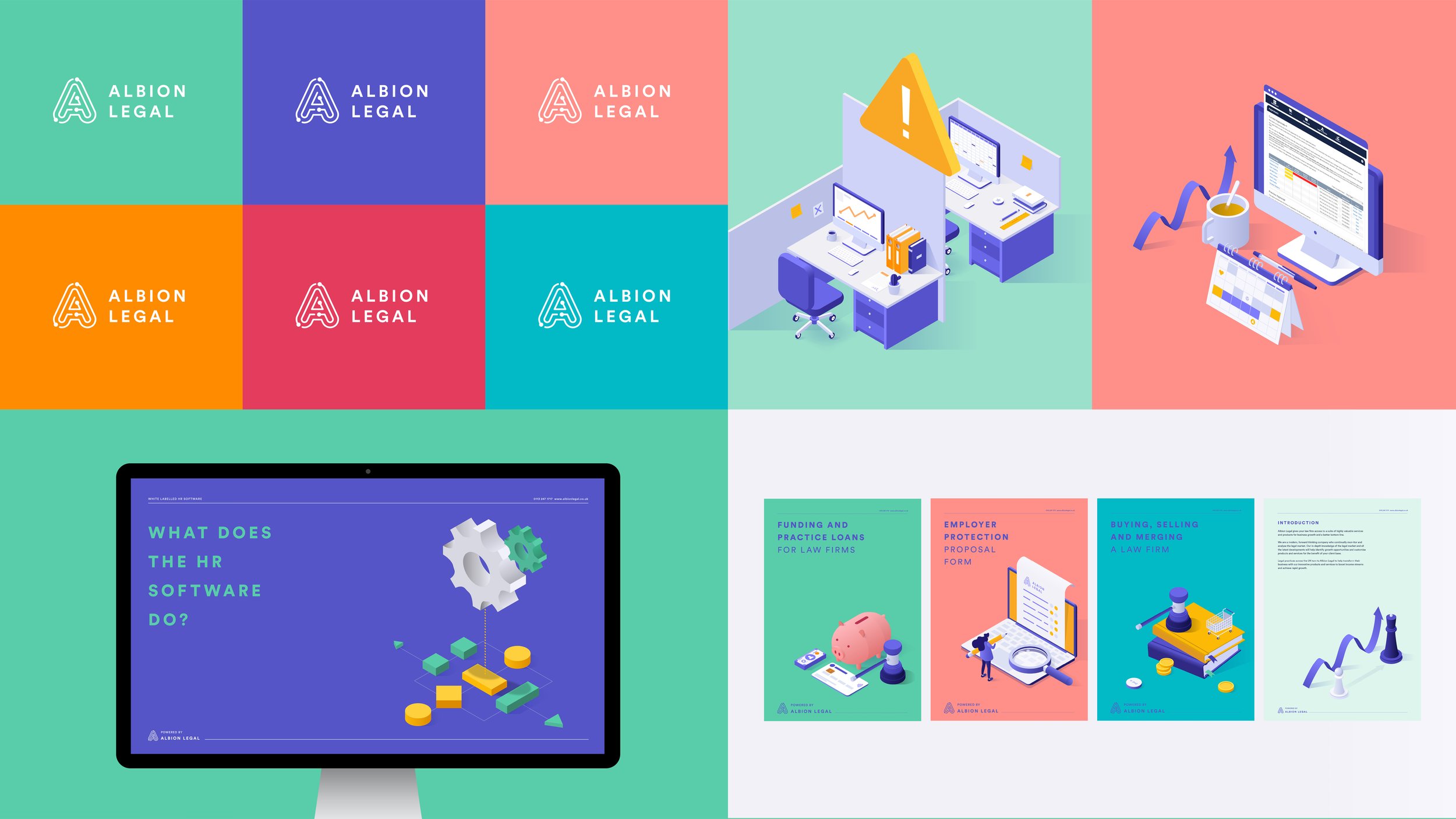
ALBION LEGAL
BRIEF
Rebrand a leading strategy provider for the law sector who are often mistaken for a law firm.
RESULT
Unreal’s brand overhaul repackaged Albion Legal as a specialist software company. Out went images of dusty legal chambers, in came bright illustrations showcasing their ground-breaking software for the legal industry.
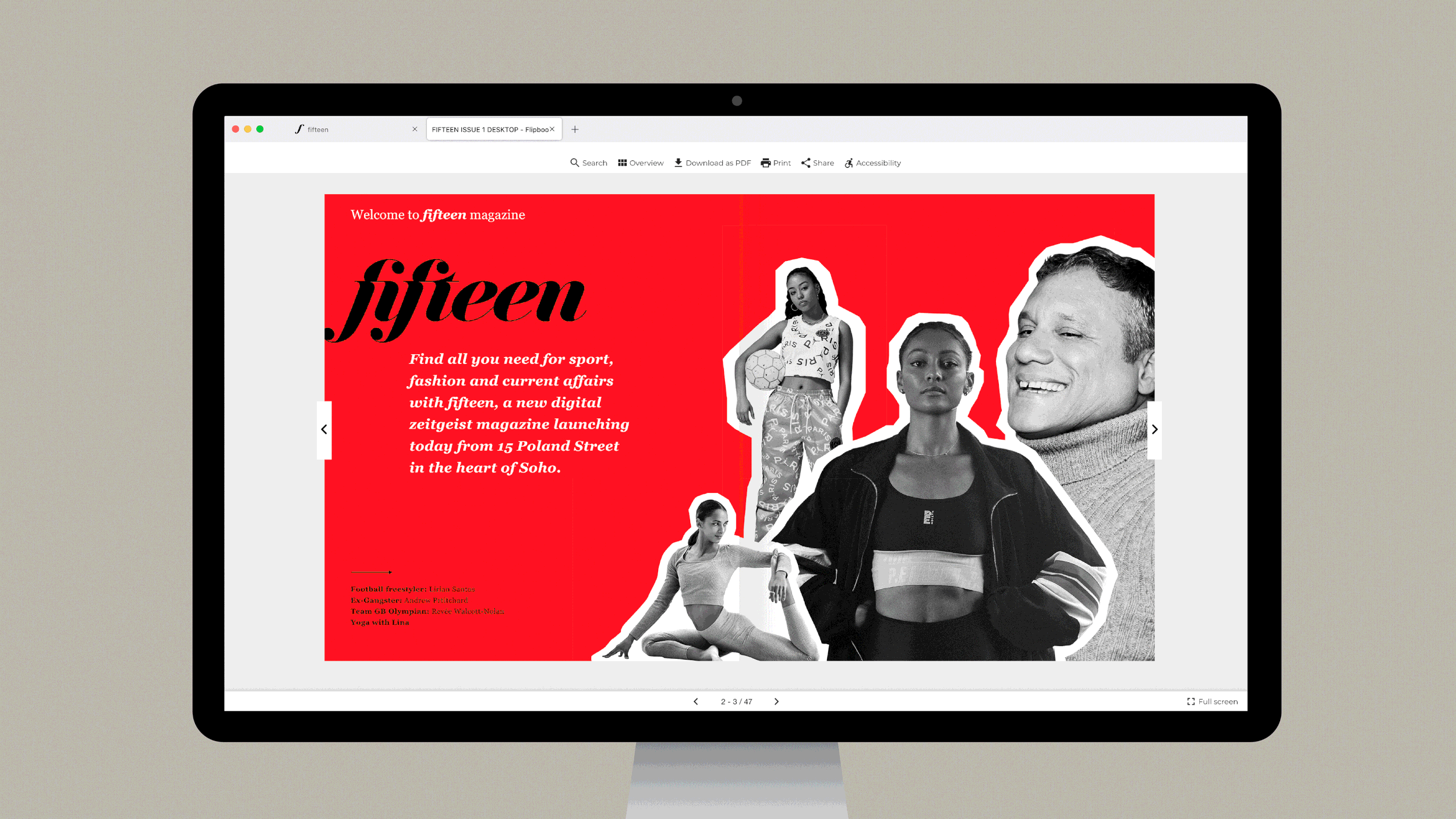
FIFTEEN
BRIEF
Design and launch a new online magazine from the heart of Soho.
RESULT
This exciting project saw Unreal collaborate with numerous journalists, agencies and photographers to successfully produce and launch fifteen.

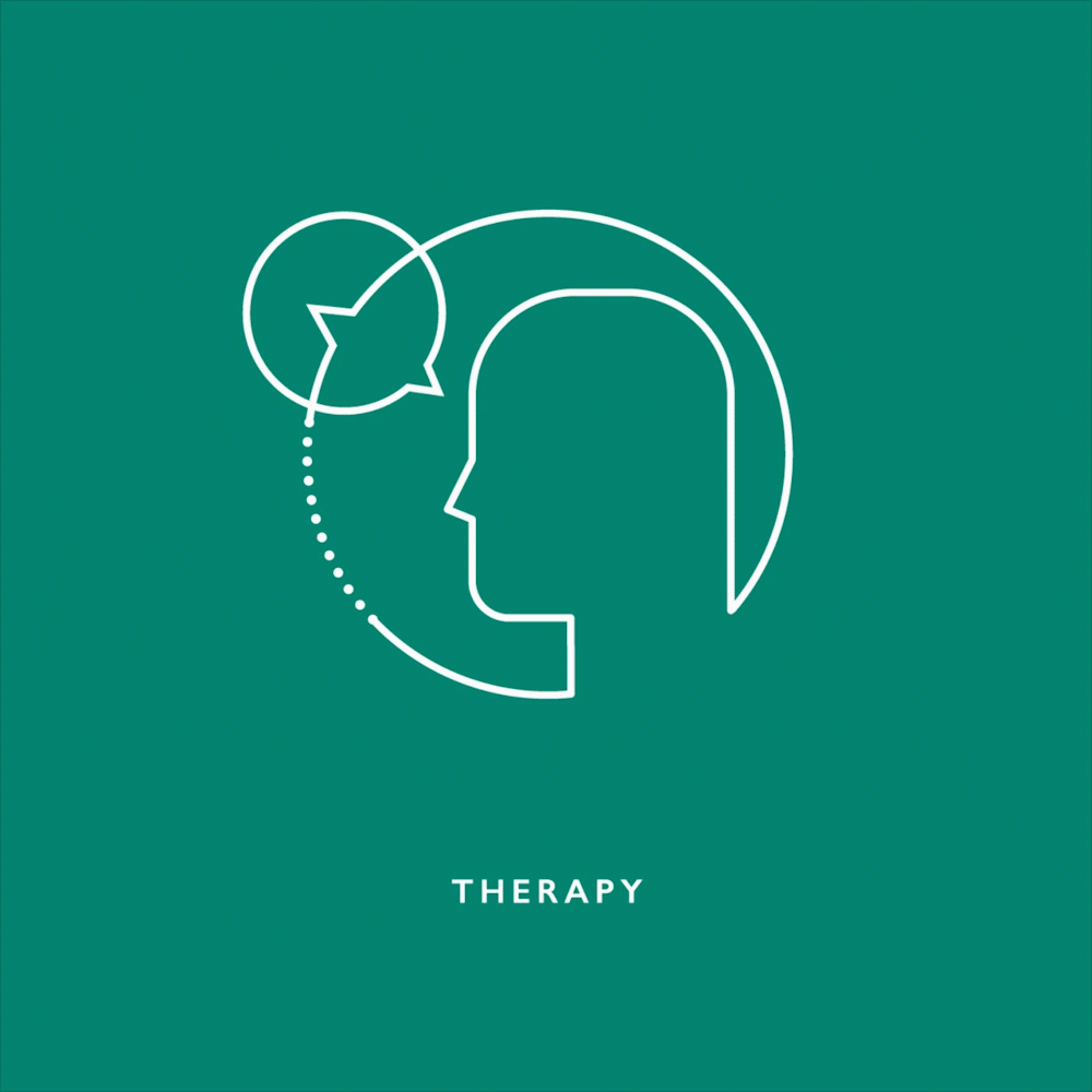
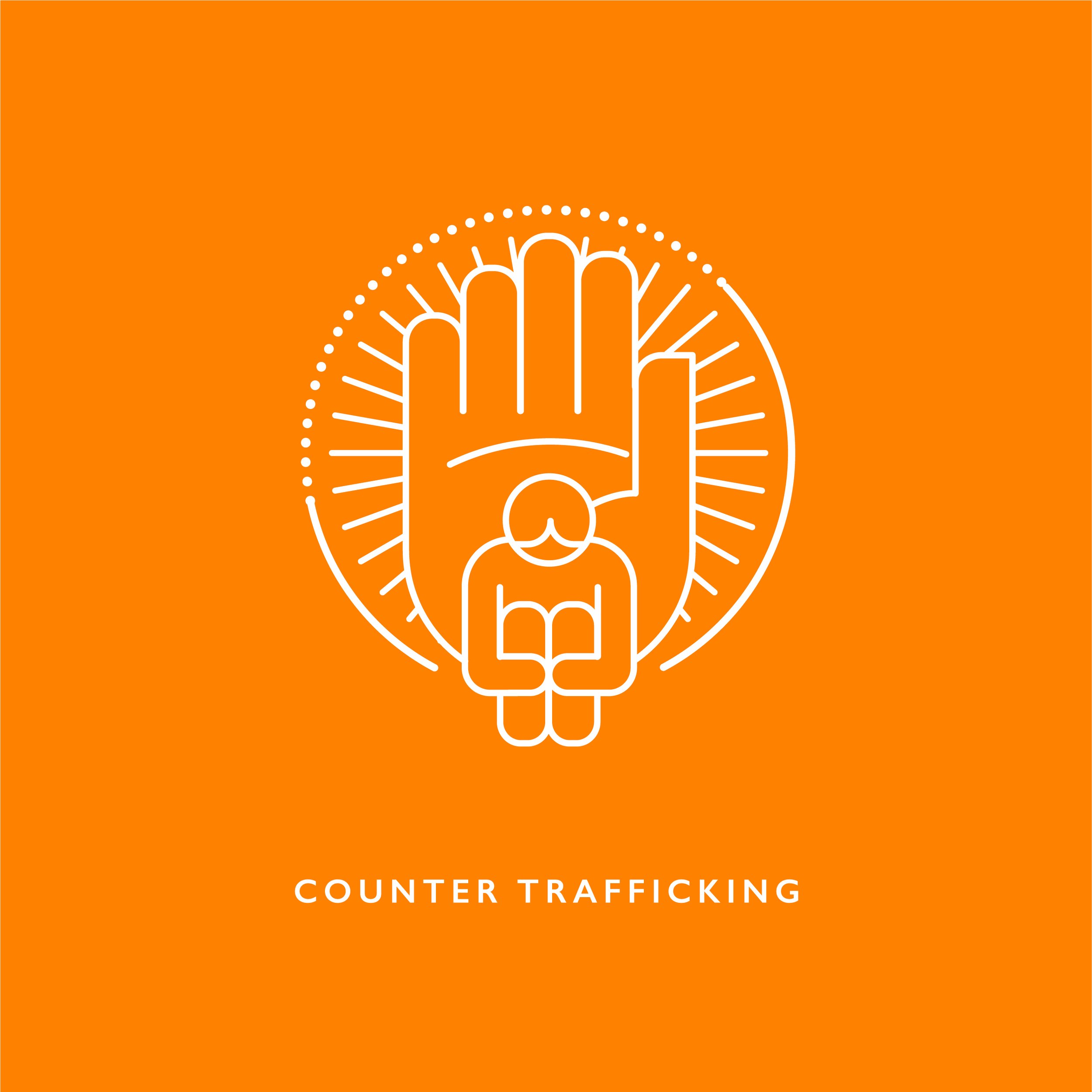
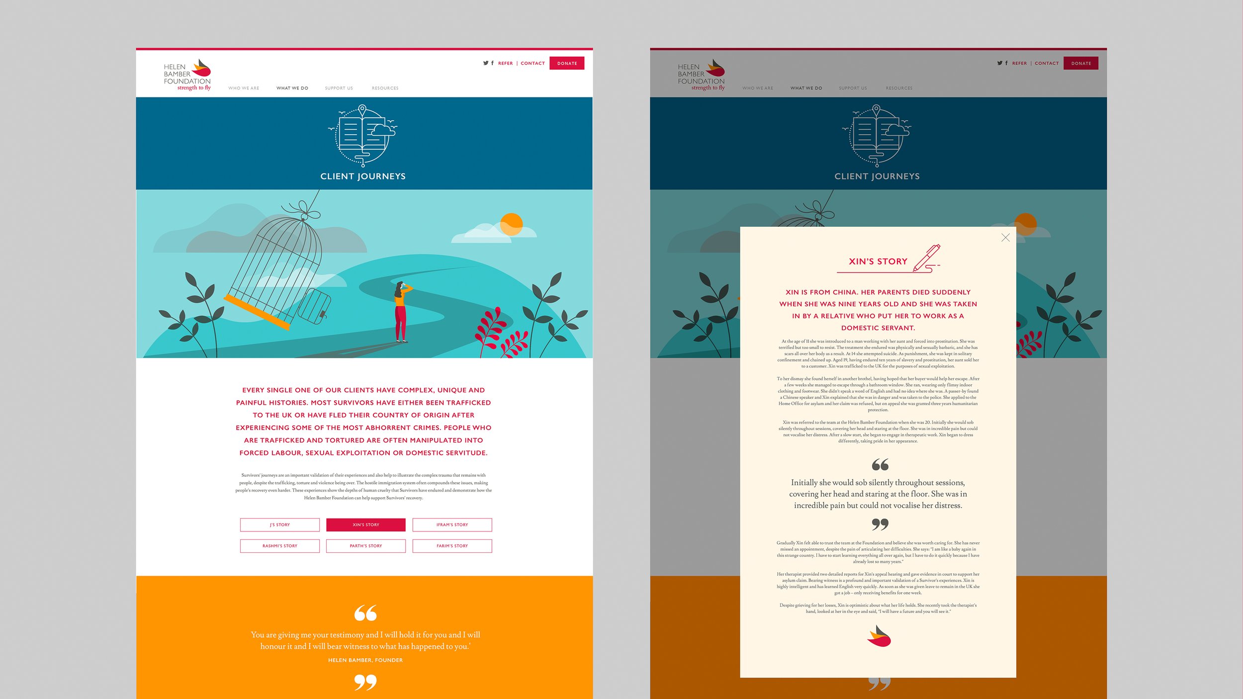
HELEN BAMBER FOUNDATION
BRIEF
Design a website for a charity that helps victims of sex-trafficking to re-integrate and flourish in society.
RESULT
HBF presented us with a couple of problems; there was no photography to play with and the content was of an incredibly sensitive nature. But the stories had to be told. Our illustrative solution is sympathetic and hopeful, allowing the overall message and stories to come through.


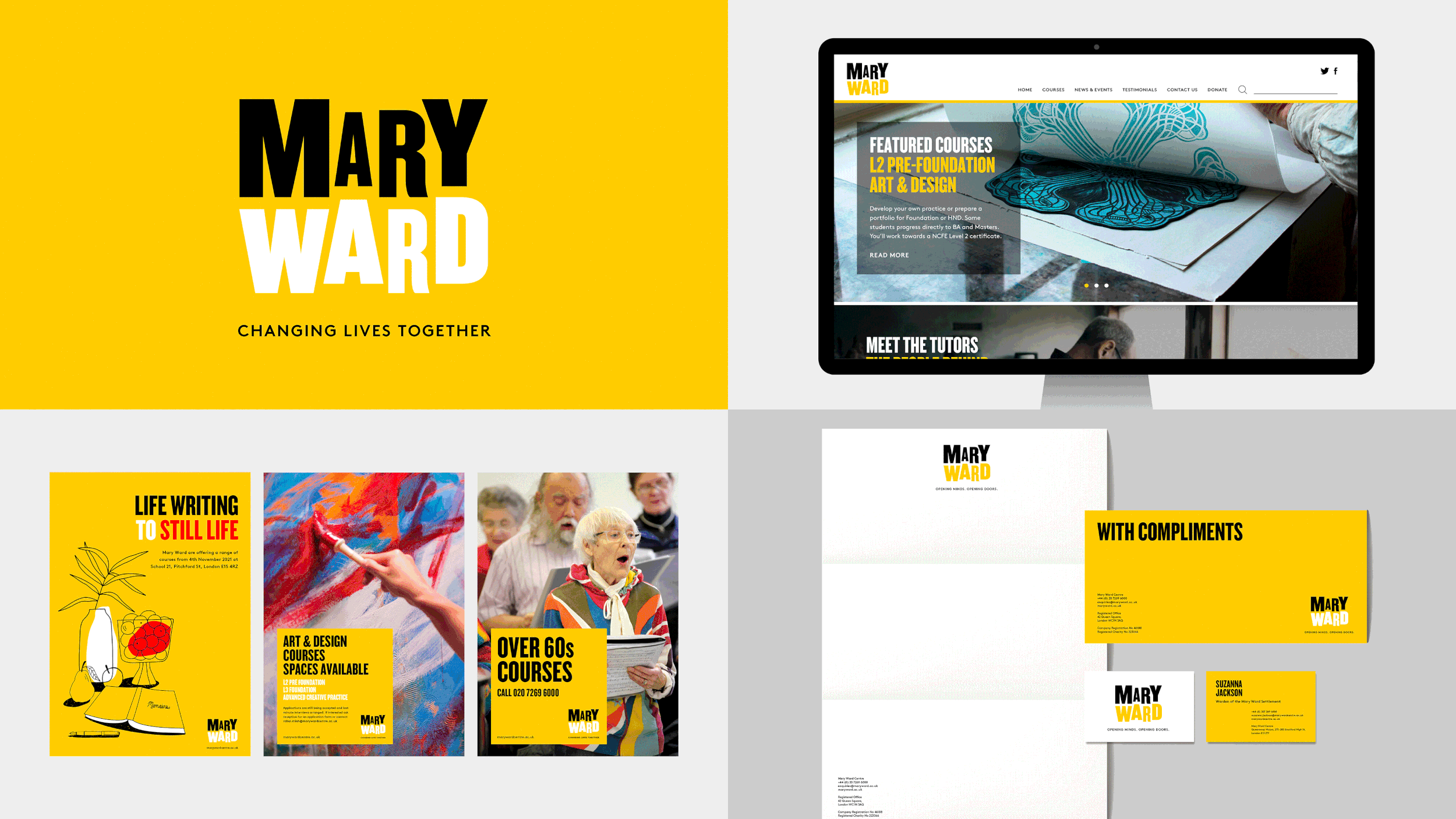
MARY WARD
BRIEF
Rebrand an historic organisation that has been educating adults from disadvantaged backgrounds for over a century.
RESULT
Unreal’s logo represents the Mary Ward ethos that their institutions welcome people from all walks of life. The identity itself had to be simple and flexible, allowing them to advertise an eclectic range of courses as well as free legal advice, an integral part of Mary Ward’s offering.

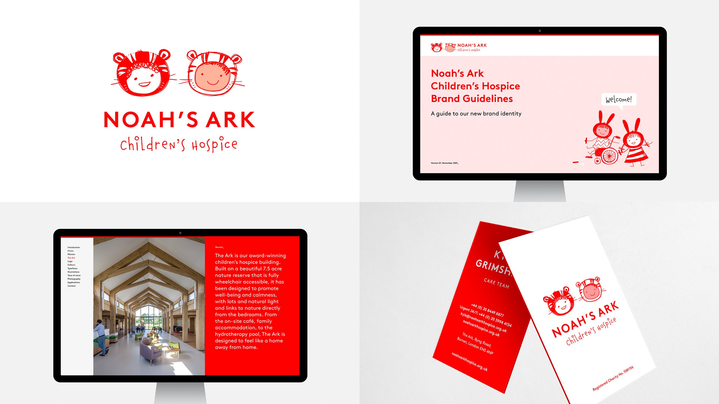
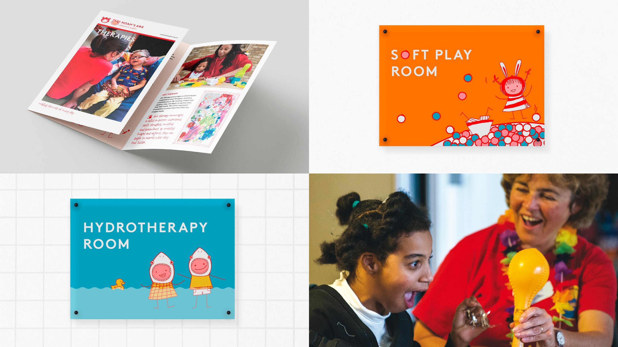
NOAH’S ARK
BRIEF
Rebrand a children’s hospice in North London.
RESULT
Noah’s Ark wanted a rebrand that injected structure and slickness in their brand, without compromising the warmth and personality of their incumbent identity. Our solution retained illustrated characters but the colour and typefaces were stripped back and tightened.

WOOWOO
BRIEF
Produce print, packaging and social media comms for a female intimate care range that really puts the ‘ass’ in ‘sass’.
RESULT
Successfully applying WooWoo’s cheeky personality whilst showcasing the quality of each product, Unreal’s design work has helped consolidate the brand’s presence online and instore – no mean feat for a new company in a saturated market.